Intern Blog #3: Information Design
Madeline is a first year MBA student at University of Southern California’s Marshall School of Business. She has an extensive background in start-up development and a keen interest in data analytics.
As an MBA candidate with a focus on Business Analytics, I know how important data is to good decision-making. However, my time at Mockingbird has really driven home that when it comes to rallying people to action, whether it be volunteers, community partners, or grant funders, data needs to be more than just spreadsheets and percentages.
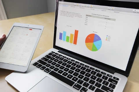
As a data analytics student and an intern, I have learned a lot about how to present information as effectively as possible. “Information design” is a trendy term for web developers and product designers, but to get as much return on your data as possible, it should be in your vocabulary, as well.
Here are my top 4 design principles based on my experience this summer as a student and an intern. I hope they can help you reach visual excellence!
1. Make it Clear, but Put Content First
It should take no more than 3 seconds to understand the general idea of a visual tool. That said, don't remove data for the sake of clarity. Though the main idea should be clear at first glance, people actually find denser visuals more trustworthy. If you find that, once all your data is visualized, the product is a jumbled mess, concentrate on better design, not filtering out content. Instead of focusing on creating more blank space, just make sure you are using it efficiently. For example, each visual should be as small as possible while remaining clear and readable. Grids can be toned down or removed entirely.
2. Use Color Carefully
Always start with a blank canvas: use black and white text, graphs, and images. Once you have a feeling for the content, begin adding color. Ideally, stick to colors found in nature and lighter hues. Keep in mind that colors should be used purposefully. As Edward Tufte said in his book Envisioning Information, use color "to label, to measure, to represent or imitate reality, to enliven or decorate."
3. Focus on Comparison
The intention of data collection and visualization is to effectively tell your story. To do this most efficiently, make sure the visual tools you use don't simply show the way things are. Instead, focus on the way things were and how you have intervened to change them. Often, this will require that your graphics are multivariate, which allows you to not only show comparison, but also gives the viewer the most information in the smallest space.
4. Don't Reinvent the Wheel
When you made your website or set up your office space, you probably didn't start from scratch, building it from the ground up. The same should be the case for information design. There is plenty of great work out there. Find out how other organizations are organizing and visualizing their data, and follow their lead! To determine where to start, the best thing you can do is get out there and research. Find out what you like, what you don’t like, and why, and build on your content from there!